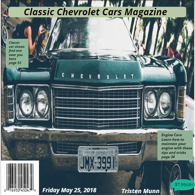
I used some balence in this to help things stand out more and maybe it will help catch your eye. There is quite a bit of rythem in it beacause I used the same kind of pictures for the whole cover. I used a big picture for my alignment for my background to make it stand out. I think that there is some good unity in it beacause everything matches and goes good with eachother. and it relates to me because i
like chevy.
Balance/contrast
this has more of a radial, it is more centered
this has good balance
Rythim/repetition
this has regular rythim because of the 2 boxes being the same sizes just on different sizes
repeats a series of progressively larger elements with larger white spaces between each for a progressive rythym
Emphasis/Allignment
Uses black type for heading. sub heads, and much lighter text for all other text and big pictures.
uses different color background for different information
Unity/Proximity
Uses 2 different fonts, that very in size and background colors.
repeats the same color theme and shape with the 2 liottle green info boxes
No comments:
Post a Comment